Based on personal preferences, which are : I want an OS that is simple, elegant, modern and deprived of visual clutter because I work on a plethora of personal projects all the time (coding/3D/web/art etc) therefore I don't want to waste my time also fixing an OS to make it work well. It needs to work well out of the box.
I also like the idea of getting used to a "stock distribution", meaning that I can install it on many computers, delete it and reinstall it completely without having to transfer my tweaks from one installation to an other in order to feel comfortable.
My research began with the intention of finding the best Linux distribution after using Ubuntu for about 10 years. I wanted something new and better, but ended up choosing Ubuntu again, because it's still the best.
This post is about a promising contender to Ubuntu that I almost installed on my main PC, but retracted when I saw some of it's flaws...
So, lets dive in :
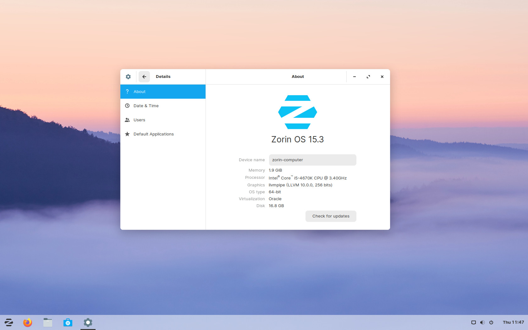
Say hello to Zorin OS 15.3 Core !
Here is why I like it and why it might beat Ubuntu (eventually) :
I like how the desktop environment look. Clean and simple, well spaced. It does not "strive for attention", it is just there, waiting. Ready to serve !
I like how their website look. It breathes and present the OS very well. It's a promising indicator (in my opinion) because if the distribution's authors can't even design their website properly, how can they design their OS properly ?
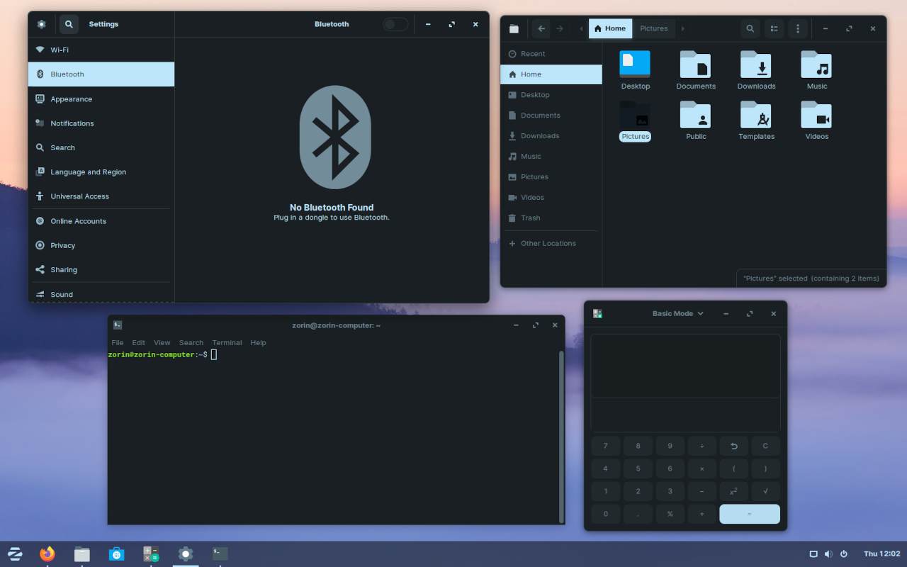
I like the absence of an OS top bar alongside a bottom bar. It's like being constantly fullscreen-mode without having to F11 all the time.
I like the files on desktop disabled by default, it forces me to organize my stuff ahead of time instead of just throwing everything on the desktop for so long that I forget what it was, until it's "cleanup-time" and I dump everything "as-is" in my big pile of dumped things. - true story.
I like that it's been around since 2008. It's not just some folks that woke up one morning with a new distro name in mind, who just took Ubuntu then picked some packages and voilà, a new OS is born !
And now lets explore why it's not perfect...
I dislike their dark mode
Every OS/website/everything should have a dark/night mode ! But sadly this one is not done right. The accent color is too much present. It's like they applied a big color filter on top of everything.
It could even mess up your perception of colors especially if you are working on art or any visual stuff !
Well, look for yourself :
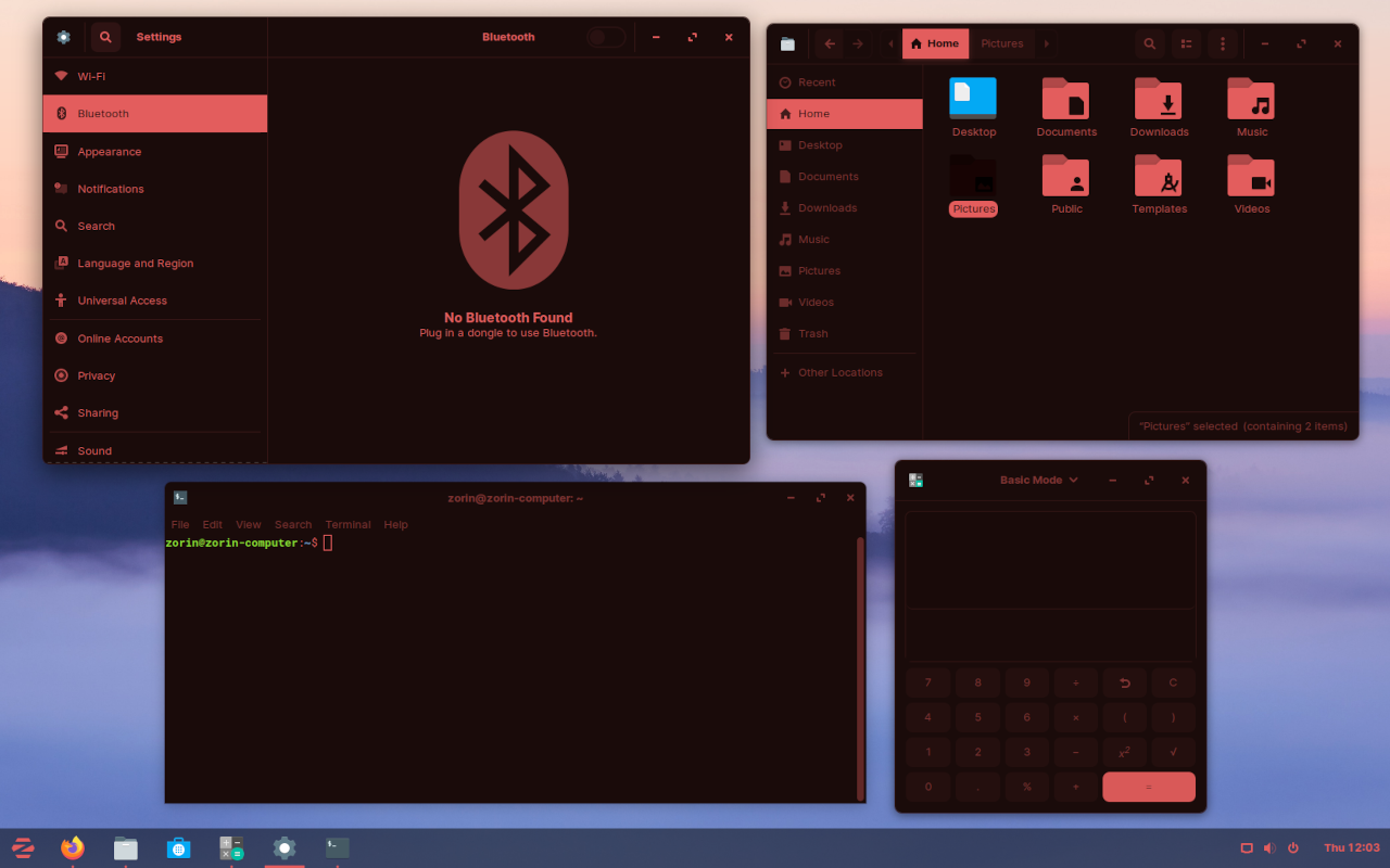
It seems like they tweaked things just so it work for their default blue accent color, and completely forgot to look at other accent colors (which they provide a "curated list of" by the way, you can't choose the specific color you want, you have to pick from their list).
And the icons color stays bluish even if you choose a completely different accent color.
The settings cog icon has a white opaque "hole" in the middle...
Overall, the dark mode feels like an after thought (and it probably was, since it's kinda new to the OS).
I like dislike the existence of a paid version
At first I was okay with that since it looked like the best OS ever on the surface. I would be welling to donate some money if it has solved my quest for the perfect OS, but it didn't !
Beside the work that has been done on the gnome apps bar, the rest feels just like a basic Ubuntu + Gnome experience. I don't think they deserve to receive money after seeing how little work have been done on their end compared to the whole Ubuntu > Gnome > Debian > Linux stack behind them...
It is not well polished
In french we have an expression for that, its "tourner les coins rond", it means like when you pass the aspirator in your room and you don't go fully into corners, you make round turns. It basically means that you botch the job. You do the most obvious part and omit the details.
That's what it feels like they did, but ironically they didn't really make round corners, it's quite the opposite :
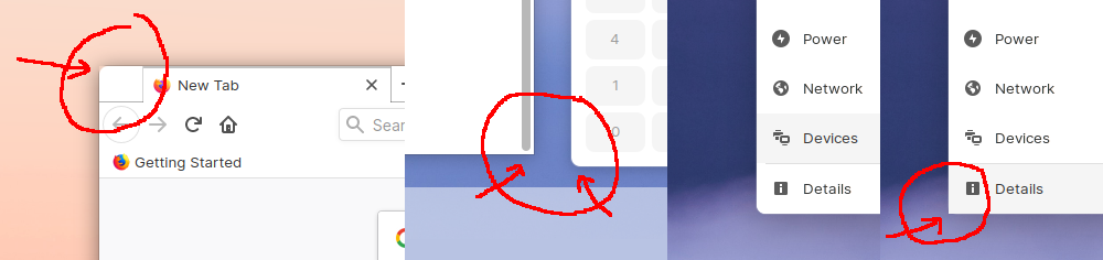
Sometimes apps overflow out of the rounded corners (and I'm not talking about old apps, I'm talking about firefox, the default browser pre-installed with the OS !).
Sometimes windows corners are round, sometimes squared ¯\_(ツ)_/¯.
Sometimes when you hover things that are in the corner of a window, the background color goes outside the rounded corner.
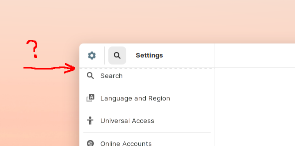
Weird design choices
Like this dashed lines to indicate that the area can be scrolled... I don't understand from where that "convention" is coming from ?
In conclusion
We can see the Zorin OS vision and where it wants to go. And I share that vision for a desktop environment, but it is poorly executed for now.
If they could fix those issues, (and I don't see why they couldn't because Ubuntu nails rounded corners and dark theme so well, since Zorin OS is based on Ubuntu, how could they mess it up ?) it would be a very solid contender to Ubuntu.
In the meantime, I'll stick with Ubuntu !